Saturday, 8 October 2011

blog assignment 10


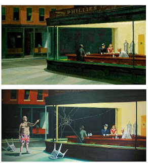
‘Nighthawks’ is a very famous painting painted by Edward hopper in 1942. It depicts a scene where people are sitting in a downtown diner late at night. It is his most famous painting as well as one of the most recognised in American art history. Banksy’s painting ‘are you using that chair’ is what some would consider a rip-off of Hoppers painting but others would call this a remix. 

Banksy’s version shows the people in the diner looking at a football hooligan, who is dressed in only a pair of union flag underpants, who has just thrown a chair at the diner window. ‘Are you using that chair’ is a classic example of Banksy’s style and use of cleaver wit. Even though a lot of aficionados still don’t acknowledge Banksy’s work as art his work has been growing in popularity and recognition much like Andy Warhol’s did in the 50s. Thus nurturing the interest if art in the youth that without him may not of happened.


[Edward hopper, Nighthawks, 1942. Banksy, are you using that chair, 2003] http://www.lovethecool.net/2009/05/14/banksys-nighthawkes/

blog assignment 9


In the world of car design today there is a trend that is starting to emerge, one that used to just be a fad for the ‘environmentally conscious’ celebrity, but now it looks like this fad is here to stay. That fad is the hybrid car.

The political and ideological message that is reverberating around the word these days is that we are leading ourselves into an energy crisis, and that one of the biggest contributors to this is the automotive industry. Car companies that used to brand themselves on performance and luxury where bigger was better are now re-branding themselves as being economic, clean and green. The most famous of these hybrid cars is the Toyota Prius. It still has a petrol engine but is coupled with an electric engine. When this technology was released on the world in 1997 it was laughed at but now more and more companies are getting involved. Manufacturers like Audi, Porsche and even Ferrari are now producing concept cars that have been designed to combine their companies old brand of high end performance with what they are going to have to turn to in the near future. Culturally and politically this is sending a message that this technology can be taken seriously and that there is hope and promise for not only the automotive industry but all the technology and industries that derive from it.
Toyota Prius

Ferrari 599 hybrid

[photo of Toyota Prius] http://getonlinecar.com/car/447/toyota-prius-pictures.cnet
[photo of Ferrari 599 Hybrid] (20.02.10) http://www.wired.com/autopia/2010/02/sneak-peek-ferrari-hybrid/

Friday, 7 October 2011

blog assignment 8


In today’s day and age design can most definitely be both art and science, yes there are situations when a design might only be one or the other, but in most cases design today will be a combination of science and art.

In the corner of design being a science the most obvious examples are things that are designed to be completely practical, they are to serve their purpose and nothing else. A fighter jet for example, it is made to be fast, nimble and stealthy with no thought or consideration to how aesthetically pleasing it is. But there is no denying, they still look awesome and as the saying goes ‘art is in the eye of the beholder’. I’m sure to a large number of people around the world a fighter jet is art.
In the other corner where design is just art there will be plenty of examples too. Take a decorative lamp for example, a lamp that one might buy purely for decoration and never to use as a lamp. This object would have been designed with one thing in mind, ‘does it look good’. However even with just that thought in mind it is still restricted to what materials it can be made out of and how those materials will behave in the form of a lamp, and if I’m not mistaken science will have a lot to do with that decision.

So ultimately there will always be aspects of design that will be considered to be just art or just science but no matter what there will always be a hint of its counterpart.


[photo of f-15 jet] (05.03.09) http://www.hightech-edge.com/f15-strike-eagle-us-air-force-usaf-navy-fighter-jet/3577/ 
[photo of decorative lamp] (23.01.11) http://homedesigndecorates.com/modern-fashionable-lighting-and-futuristic-round-chandelier-designs


Saturday, 1 October 2011

blog assignment 7


Today the internet and the digital age are changing how media and design is purchase, shared and spread. The internet is an ever growing part of our lives.
Producers have picked up on the fact that online stores, digital media and social networking sites have become an integrated part of our lives, and they are now designing and creating for this new universe. A great example is how people can now buy online content. Music, movies and games can all be purchased online, already in digital form, ready for our i-pods, phones or tablets. This digital content is beginning to render the need for products physical counterpart useless. Why go to the store to buy a CD when you can just get it off i-tunes for cheaper and less effort? This in turn also illuminates the need for the design of physical storefronts. This digital universe has also changed the way we advertise. Posters are becoming more and more scarce thanks to social networking sites like facebook, all you need is a few posts online in within days thousands of people can know about an event.
The internet and digital media that it gives access to is a symbolic universe and designers are having to change their ways to keep up with the new generation of consumers that use the internet as an everyday part of their lives.


[Picture of i-tunes online music store] (13 September, 2006) http://mac.sillydog.org/archives/001521.php

Saturday, 10 September 2011

Blog assignment 6


Walter Benjamin said “To an ever greater degree the work of art reproduced becomes the work of art designed for reproducibility. From a photographic negative, for example, one can make any number of prints; to ask for the authentic print makes no sense.” Concerning art and the new age of digital design and manufacture I disagree with him.
For example, Pablo Picasso’s painting Guernica (1937) would have to be, in my opinion, one of the most impressive paintings in the world. However if you were to see a print or a copy of it, or even a picture of it on the internet, there is now way you would really be able to appreciate it for what it really is. We need originals because when we see them in person we feel their aura, and aura is probably the most important thing about the original. You can see for you self every brush stroke, all the time and effort that went into producing the painting, that is what makes it so impressive. With a print you don’t get that link, the feeling of how much time went into the work. With an original photograph it’s slightly different but because you know that the artist is directly and entirely responsible for this work, so you still get that sense of aura.


Friday, 19 August 2011

Blog assignment 5


Ogden Rood and Vincent van Gogh, two men who changed the way we look at and consider colour. Their experiments and productions directly influenced our understanding of colour. They also developed, and expanded on the theory of ‘colour vision’.

In 1879 Rood wrote ‘Modern Chromatics, with applications to art and industry’ and with this introduced the world to his theory optical colour mixing. Rood suggested that small dots or lines of different colours, when viewed from a distance, would blend into a new colour. This idea is hugely influential in the way we understand how colours behave when put side by side with another colour. You can see this theory being used in the paintings of Vincent van Gogh in his post impressionism stage.

Vincent van Gogh influenced our understanding of colour and thanks to his experimentation and use of colour in his paintings, not only did he change how people looked at colour but he also showed people that colour could be used to portray feeling and emotion. He used colour in a way that his paintings showed not what he saw but more what he felt. This is important because he showed that people could use colour to express feelings and experiences rather than just to record things as they were. A great example of this is his painting The Night Cafe’ 1888.


Saturday, 6 August 2011

blog assignment 4


When I think about what Adolf Loos said in his essay ornament and crime “The evolution of culture is synonymous with the removal of ornament from objects of daily use.” I find it very difficult to agree with the man, but at the same time he does have a point. Consumer items of today are design to be sleek and minimalist, for example take the ever popular i-phone. The i-phone’s design is to make it as simple as possible, and by today’s standards that makes it look good and appealing. This would suggest that indeed the evolution of culture is going hand in hand with the removal of ornament. However if we look deeper into the i-phone and its design we see something that contradicts Loos’ statement. Yes, the product is designed be the producer to be simple, and ornament free, but once it gets to a person, the ‘culture’ it was intended for, it is almost always wrapped up in a cover or skin to personalize it to the owner. It gets ornamented.
“The ornament of a savage tribe, being the result of a natural instinct, is necessarily always true to its purpose.” Owen Jones, Ornament of Savage Tribes, 1856
The almost instant customizing, ornamenting, of our possessions shows that people or culture still has the desire to ornament even if it may not be in the way things were ornamented in Adolf Loos’ time.